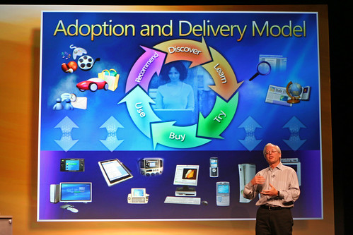
Holy. Crap. If there is any reason to avoid software designed by this group of people, it’s likely this slide:
Now, I’m really not trying to slag the fine folks at Fisher Price Toys, but man, this presentation (and WinXP, and other MS stuff) simply has to have been born at the toy company, rather than the largest/most mature software company on the planet.
I mean – can they fit any more information into the slide? Perhaps, if they use more colours, or fonts, or sizes of fonts. Compare that to a Stevenote, with the simple yet powerful elegance. This is the difference between the Windows Media Center Edition remote, and the Front Row remote – 800 buttons vs 6.
I’d like to assume that for a Big Keynote Presentation, that a company would pull out all stops and design the best presentation they possibly could. If that assumption holds, then MS can’t do any better than that. That’s scary.
Mike Evangelist at Writer’s Block Live tells it better – and he should know, since he was involved with Apple product marketing and Stevenotes.
Compare with a sample Stevenote slide:

Photo by olebra
Update: Just cracked open my latest National Geographic, and it’s running a full-page ad from MS Canada – the insanely busy super-cool ad. You know the ones, with 6 fonts, 10 font sizes, busy DNA double helices spiraling out of a window embedded in a boy’s chest, with green birds and blue elk and astronauts and butterflies and dinosaurs and flowers and fish and text that is askew at all kinds of funky-cool angles. The ads that look like they are designed by programmers, and are so cluttered and busy that you’re not really sure what the message is? Yeah… At least their advertising is consistent with the keynote presentation announcing Windows Live.
Update: Graham pointed out that I was being an insensitive ass with a reference I’d intended to be a throw-away comment, but hadn’t thought through the ramifications of what I’d said. I was insensitive and clumsy by using the reference (my words, not Graham’s), and I apologize to anyone that may have been offended by it. The reference has been modified, and actually reads better now as well. Think. Before. Clicking. Save. Dumbass.
Holy. Crap. If there is any reason to avoid software designed by this group of people, it’s likely this slide:
Now, I’m really not trying to slag the fine folks at Fisher Price Toys, but man, this presentation (and WinXP, and other MS stuff) simply has to have been born at the toy company, rather than the largest/most mature software company on the planet.
I mean – can they fit any more information into the slide? Perhaps, if they use more colours, or fonts, or sizes of fonts. Compare that to a Stevenote, with the simple yet powerful elegance. This is the difference between the Windows Media Center Edition remote, and the Front Row remote – 800 buttons vs 6.
I’d like to assume that for a Big Keynote Presentation, that a company would pull out all stops and design the best presentation they possibly could. If that assumption holds, then MS can’t do any better than that. That’s scary.
Mike Evangelist at Writer’s Block Live tells it better – and he should know, since he was involved with Apple product marketing and Stevenotes.
Compare with a sample Stevenote slide:
Photo by olebra
Update: Just cracked open my latest National Geographic, and it’s running a full-page ad from MS Canada – the insanely busy super-cool ad. You know the ones, with 6 fonts, 10 font sizes, busy DNA double helices spiraling out of a window embedded in a boy’s chest, with green birds and blue elk and astronauts and butterflies and dinosaurs and flowers and fish and text that is askew at all kinds of funky-cool angles. The ads that look like they are designed by programmers, and are so cluttered and busy that you’re not really sure what the message is? Yeah… At least their advertising is consistent with the keynote presentation announcing Windows Live.
Update: Graham pointed out that I was being an insensitive ass with a reference I’d intended to be a throw-away comment, but hadn’t thought through the ramifications of what I’d said. I was insensitive and clumsy by using the reference (my words, not Graham’s), and I apologize to anyone that may have been offended by it. The reference has been modified, and actually reads better now as well. Think. Before. Clicking. Save. Dumbass.
Related
It reminds me of the time I was helping a friend set up a new Windows laptop they had just bought (I think it was a Dell, but I’m not positive). When we got the thing fired up, and finally got to the desktop, there were two entire columns of icons down the left side of the screen. This was all the ‘standard’ stuff installed on the machine. Somehow, somebody thought that would be useful.
That’s the problem – each icon probably _was_ useful to a small audience. But nobody had the balls to say “hey – the overall experience is just as important, if not moreso, than each individual need” – there is no Steven P. in the Windows world.
Interesting that ‘learn’ and ‘buy’ are just two steps apart in Microsoft’s version of the great wheel of life…
It’s all about consumerism… Nothing worth doing is worth doing without buying something first.
I mean – can they fit any more information into the slide?
No, they can’t. But they could’ve made it blink, or have the arrow-wheel spin on its axis. That would’ve been trippy.
Ooh! A spinning arrow wheel, with volumetric glowing, and perhaps colour cycling! THAT would get the point across so much better!
I think the pic from the Steve-note says it all. There’s a couple of remotes with a button for every possible function, and then there’s the Apple remote which has a simple user interface that does everything. That pretty much sums up the difference between the Windows and Apple approaches to user interface design.
Of course, there’s always the Linux approach to UI, so what would a Linux remote control look like. Well, before you could use it you’d have to unzip the tarball, then run “make” and “make install” for each function you would want on the remote.
[…] Here is are two other blog entries that compare the two companies and their approach to product presentation, Microsoft Live – Designed by Fisher Price and How to present Microsoft-style: Steve Jobs, you’ve got nothing to worry about. […]
[…] Au-delà du giron des amateurs de Microsoft, ce n’est guère le produit Windows Live qui a attiré l’attention, mais plutôt la présentation maladroite effectuée par la compagnie. D’Arcy Norman a qualifié cette présentation de Fisher Price, car ses couleurs et ses formes rappellent les jouets produits par cette compagnie. Garr Reynolds fait une analyse comparée très intéressante des présentations de Steve Jobs (Apple) et celle de Bill Gates (Microsoft). Et celle de Steve Jobs gagne largement : le contenu est présenté clairement et efficacement. Celle de Bill Gates n’est qu’un fouillis incompréhensible. Était-ce voulu ? Ne lit-il pas les ouvrages publiés par sa maison d’édition ? […]
no… linux would require to first go to the terminal and start remote control.