Redesigning the UCalgary D2L homepage

It seems like a small, unimportant thing, but the D2L homepage is probably the single most important web page for students. While they occasionally use the university website, and periodically use the my.ucalgary.ca portal (to sign up for courses and pay fees), D2L is where they spend a substantial chunk of their time as they work through their courses and programs. We’d launched D2L with a news-centric homepage, so that we could easily push notifications and support resources during the transition from Blackboard. It worked well for that, but became a dumping ground for accretion – links added, blurbs added, until it was a wall of text that everyone basically ignored.

So, we took a look at how students use D2L, and what they needed on the homepage. It’s their place, not The Institution’s, so it needs to be useful to students with a much higher priority than anyone else. The first thing students need is access to their courses. That used to be tucked into a small widget in the right sidebar. Now, it has the prime spot at the top of the main content area (where it should have been all along). Then, they need to be able to see what’s coming up – important dates on the calendar. Also, now right on the homepage. And they can enable it to show events from any of their courses as well (and then integrate it into their phones etc… through the iCal format). One thing that surprised us was the seemingly-trivial idea of having a weather widget on the homepage. Why on earth would that be needed? Clearly not necessary. But it can’t all be about need and necessity – sometimes it’s important to have a subtle reminder to go outside on a nice day (or a reminder to stay inside and study when it gets crappy outside).

I also made the decision to take many of the “Important Links” out – they were important to the people that wanted them there, but not necessarily to the students. We looked through the aggregated (and anonymized) web analytics to see which links had actually been used since January 1, 2015. Not many. So we made the call to remove several.

Also, we added a link to let students (and others) give feedback so we can hear complaints or suggestions and respond more quickly.

The Instructor-focused portions are not displayed to students – they don’t see the Instructor Resources or Grades Export sections because they’re not relevant. Students now get a pretty streamlined homepage (as it should have been from day 1), which should help them get to what they need, and to help keep organized throughout the semester.

It’s a collection of many small, seemingly trivial changes, but the overall redesign should make things much less painful for students.
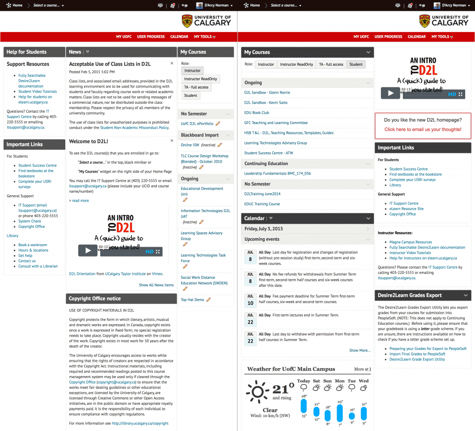
D2L homepage, comparing old crappy version and awesome new version.
Left: the previous version, accreting things since launch in 2013. Right: Redesign with student needs given priority.

Notes: Chin et al. (1988). Development of an instrument measuring user satisfaction of the human-computer interface

Chin, J.P., Diehl, V.A., & Norman, K.L. (1988). [Development of an instrument measuring user satisfaction of the human-computer interface](http://portal.acm.org/citation.cfm?id=57203&dl=). CHI ’88 Proceedings of the SIGCHI conference on Human factors in computing systems. 213-218.

interesting (and short) article on analyzing user satisfaction in some software. the only quote relevant to my project is on efficiency vs. satisfaction as descriptors of effective interface design:

>For many tasks, speed and accuracy are two related performance measures which affect a person’s attitude toward the system. The time it takes to learn a system and the retention of acquired knowledge over time also affect the utility of a system. User acceptance of a system (i.e., subjective satisfaction) is also a critical measure of a system’s success. Although a system may be evaluated favorably on every performance measure, the system may not be used very much because of the user’s dissatisfaction with the system and its interface.

redesign

I’ve switched themes on my blog. Again. And, once more, I just yanked an off-the-shelf theme and slightly tweaked the CSS to make it do what I want.

Before (left), using the excellent Journalist theme, and after (right) using the Magazine Basic theme:

journalistmagazine-basic

They’re both good, so why switch? I was messing around with Magazine Basic for a blog at the Teaching & Learning Centre, where we needed a more magazine or newspaper feel to it. And was struck by how much I liked the theme. I like that it’s very clean, but polished. It only shows excerpts for the last few articles on the front page, and will show small versions of images if they’re available for a post. I like that it’s not purely river-of-posts – there’s no “Older Posts” link on the front page. Once things trickle off the front, they’re accessed via the category and tag pages. No humans use the “Older Posts” stuff, and googlebot has a full index of the site, so that design was redundant clutter anyway. I like that full posts aren’t on the front page – that means more posts are visible at a glance, and most people won’t even notice because they’re coming from Google (directly to a post anyway) or RSS.

I’ll give it a try for awhile. But so far, I’m really liking it.

UCalgaryBlogs.ca Redesign

I’ve been meaning to redesign the main site at UCalgaryBlogs.ca for awhile now – the Edublogs Clean theme isn’t intended to be dropped in as a stock theme, but as a starting point for hacking something tailor-made. The Edu-Clean theme is available as part of the fantastic Premium WPMUDev subscription – and it certainly helped me get UCalgaryBlogs.ca off the ground quickly.

Edu-Clean has bugged me because it hijacks the front page by using home.php, rather than using a page template to render the front page. The annoying part of this technique is that it makes it difficult to list blog posts within that site – so news updates posted on the main blog only show up on the “latest posts” widget, and then disappear from sight when they roll off the bottom of the widget.

And, the Edu-Clean theme, while looking fantastic and being very well designed and polished, is really just the Edublogs theme. So, my straight reuse of the graphics and styles was a bit confusing (I had a couple people mention “oh, that’s edublogs. I know that.” – um. no. it’s not, but it’s using the same theme… confusing…)

So, today I decided to sit down and hack the best parts of Edu-Clean out, and graft them into a copy of the sweet and flexible Carrington theme.

I’ll post a description of what I did, why, and where, but for now it’s basically working. It’s still very much a work in progress (I’m thinking it’s a little busy, but I like the focus on community, content and function rather than marketing). The other nice thing that the use of page templates allows is the WordPress front page setting – I can set the front page to be rendered by a static template, and set the “real” blog to be displayed at another page on the blog – Site News, for example. Much better, IMO.

Here’s the previous design, powered by the elegant Edu-Clean theme:

And the redesign, based on Carrington:

I’m certainly no designer, but I like that the featured content is right up front, rather than marketing info about the service. It’s also much easier to spot the login info (if not logged in) and stuff you can do (list of your blogs, etc…) without having to scroll down.

I’ll be tweaking it, but I think it’s a keeper.

rebirth

I’ve been planning to reboot this blog with a simplified theme, perhaps a magazine-type layout. I’ve decided to start with this Blue Zinfandel theme, and have started hacking on it. No more banner images. No more heavy design. Mandigo has served me well (as K2 did before that). But it’s time for change.

There may be some things missing for now, but it’s time to simplify.

Of course, now that Jen launched her new theme for her blog today, I’m just totally following her again. But I’ve been planning this for weeks. Honest. Whatever…

Captain Obvious works for Dell’s Internet Team

I just went to the Dell website to look something up, and was rewarded by this incredible bit of sleuthery on the part of Dell’s crack team of internet designers:

You are in Canada.

Thank you, Captain Obvious.

The web designers didn’t indicate if my being in Canada somehow altered the behaviour of the website, or if the selections were somehow tuned to my location. Just to brag that they were clever enough to detect where I’m located. It might have been more useful to have the message read something like “You are currently viewing the Canadian Dell Store.” It’s a little less braggish, as opposed to “Dude! We TOTALLY located your IP address! We are teh kool! You’re in CANADA. Dude…”

Microsoft Live – Designed by Fisher Price

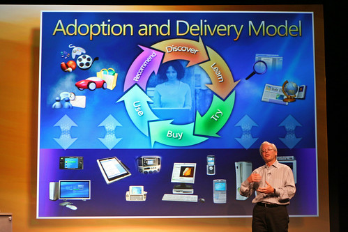
Holy. Crap. If there is any reason to avoid software designed by this group of people, it’s likely this slide:

Now, I’m really not trying to slag the fine folks at Fisher Price Toys, but man, this presentation (and WinXP, and other MS stuff) simply has to have been born at the toy company, rather than the largest/most mature software company on the planet.

I mean – can they fit any more information into the slide? Perhaps, if they use more colours, or fonts, or sizes of fonts. Compare that to a Stevenote, with the simple yet powerful elegance. This is the difference between the Windows Media Center Edition remote, and the Front Row remote – 800 buttons vs 6.

I’d like to assume that for a Big Keynote Presentation, that a company would pull out all stops and design the best presentation they possibly could. If that assumption holds, then MS can’t do any better than that. That’s scary.

Mike Evangelist at Writer’s Block Live tells it better – and he should know, since he was involved with Apple product marketing and Stevenotes.

Compare with a sample Stevenote slide:
Stevenote slide
Photo by olebra

Update: Just cracked open my latest National Geographic, and it’s running a full-page ad from MS Canada – the insanely busy super-cool ad. You know the ones, with 6 fonts, 10 font sizes, busy DNA double helices spiraling out of a window embedded in a boy’s chest, with green birds and blue elk and astronauts and butterflies and dinosaurs and flowers and fish and text that is askew at all kinds of funky-cool angles. The ads that look like they are designed by programmers, and are so cluttered and busy that you’re not really sure what the message is? Yeah… At least their advertising is consistent with the keynote presentation announcing Windows Live.

Update: Graham pointed out that I was being an insensitive ass with a reference I’d intended to be a throw-away comment, but hadn’t thought through the ramifications of what I’d said. I was insensitive and clumsy by using the reference (my words, not Graham’s), and I apologize to anyone that may have been offended by it. The reference has been modified, and actually reads better now as well. Think. Before. Clicking. Save. Dumbass.

Weblog Usability Top 10 Mistakes

So, Jakob Nielsen is at it again, with a list of The Top Ten Weblog Design Mistakes. Surprisingly, this blog does relatively well at avoiding the stuff he’s pointing out. I could be linking posts together better – I’ve been relying on tags/categories/”related entries” to do that automagically, since links will likely break if I change blog software sometime in the distant future. However, more explicit links would be a Good Thing™.

Other than that, I suppose I should update my “about” page with an actual photo, rather than the cheezy South Park avatar.

And I will continue to mix topics, thank you very much. This blog is my outboard brain first and foremost, and as long as I have more than one topic rolling around in my skull, there will be more than one topic mixed together here.