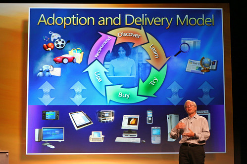
Holy. Crap. If there is any reason to avoid software designed by this group of people, it’s likely this slide:
Now, I’m really not trying to slag the fine folks at Fisher Price Toys, but man, this presentation (and WinXP, and other MS stuff) simply has to have been born at the toy company, rather than the largest/most mature software company on the planet.
I mean – can they fit any more information into the slide? Perhaps, if they use more colours, or fonts, or sizes of fonts. Compare that to a Stevenote, with the simple yet powerful elegance. This is the difference between the Windows Media Center Edition remote, and the Front Row remote – 800 buttons vs 6.
I’d like to assume that for a Big Keynote Presentation, that a company would pull out all stops and design the best presentation they possibly could. If that assumption holds, then MS can’t do any better than that. That’s scary.
Mike Evangelist at Writer’s Block Live tells it better – and he should know, since he was involved with Apple product marketing and Stevenotes.
Compare with a sample Stevenote slide:

Photo by olebra
Update: Just cracked open my latest National Geographic, and it’s running a full-page ad from MS Canada – the insanely busy super-cool ad. You know the ones, with 6 fonts, 10 font sizes, busy DNA double helices spiraling out of a window embedded in a boy’s chest, with green birds and blue elk and astronauts and butterflies and dinosaurs and flowers and fish and text that is askew at all kinds of funky-cool angles. The ads that look like they are designed by programmers, and are so cluttered and busy that you’re not really sure what the message is? Yeah… At least their advertising is consistent with the keynote presentation announcing Windows Live.
Update: Graham pointed out that I was being an insensitive ass with a reference I’d intended to be a throw-away comment, but hadn’t thought through the ramifications of what I’d said. I was insensitive and clumsy by using the reference (my words, not Graham’s), and I apologize to anyone that may have been offended by it. The reference has been modified, and actually reads better now as well. Think. Before. Clicking. Save. Dumbass.