John sent a link to our loose group of cycling buddies, and I’ve read the article 3 times now. Each time, it feels like it hits closer to home.
I’ve been riding my bike as the primary way of getting around, and have been communiting by bike almost exclusively since 2006. I’ve always ridden, but never really considered myself a cyclist until then. I was never athletic, never good at sports. But I was happy on a bike. Over the years, I actually got pretty good on a bike. I could make it go fast. I could climb hills. I could ride far. It was awesome.
And then it started feeling less awesome. Most recently, with my bad knee. Late last year, I somehow managed to get a stress fracture at the top of my tibia. I didn’t even know it had happened, and only wound up at the doctor because I thought I was dealing with progressive arthritis or something. Nope.
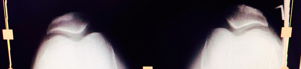
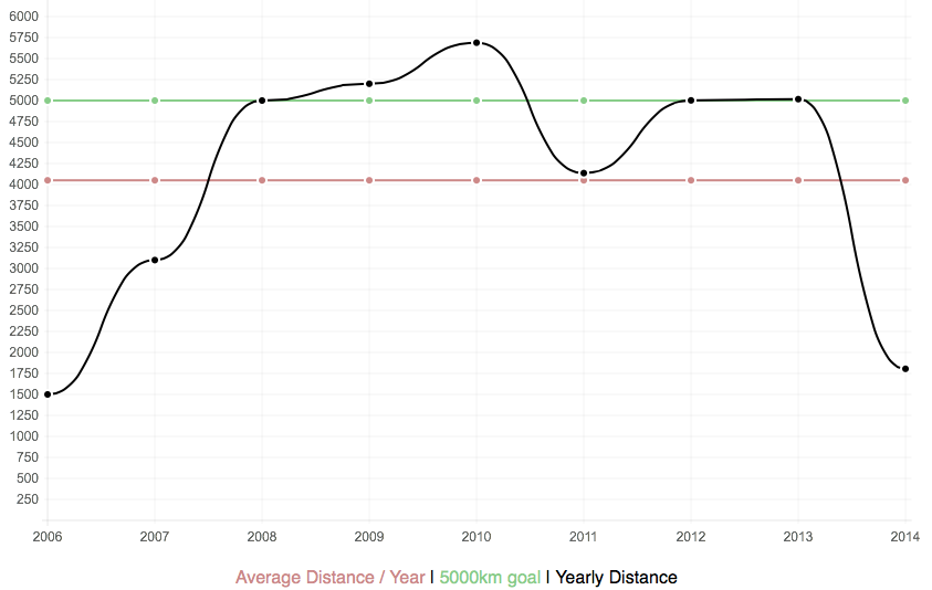
We couldn’t find any specific incident that might have caused it, but the doctors thought it may have been related to repetitive stress and strain while riding ~5,000km/year. Which meant it was self-inflicted. I’d been pushing myself for the last few years to try to keep up that pace. And, while limping around like a 70-year-old, I realized that I hadn’t been doing myself any favours. One knee is already pretty much shot, the other is likely not far behind it. And pushing to hit 5,000km/year wasn’t helping things. I’m largely recovered now – the knee is still sore, and feels weaker than it should, but it works. Physio has helped, but it’s obvious I need to pay attention to it before it gets worse.
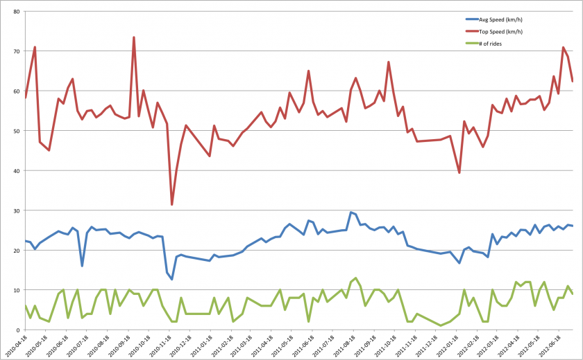
 I’ve been tracking personal metrics since 2006 – with detailed GPS logs since 2010, thanks to my use of Cyclemeter. Recently, I’ve added Strava to the mix. I really notice that I push myself more when I know a ride will be posted to Strava – either I need to let go of that, or I need to stop posting rides1.
I’m not really sure why I was pushing myself to keep hitting 5,000km/year. I think it was the feeling of accomplishment, of achieving a goal that not many people do. Some kind of macho “I’m not getting old! look what I can do!” thing. Whatever. I’m letting that go. I’m still going to ride as much as I can, but I’m not going to push it. I’m going to slow down, again. And have fun.
I’m registered in the Banff Gran Fondo this weekend. 155km, from Banff to Lake Louise and back2. I had been stressing out, because I lost 6 months of riding – of TRAINING! – and there was no way I’d be able to keep up a competitive pace. But that’s OK. I’m going to go for a nice ride. Stop at the rest stops. Enjoy the mountains. And I’ll finish when I finish.