The cycle path to happiness

Half the patients were allowed to ride at their own pace, while the others were pushed incrementally harder, just as the scientist’s tandem companion had been. All patients improved and the "tandem" group showed significant increases in connectivity between areas of grey matter responsible for motor ability. Cycling, and cycling harder, was helping to heal their brains.

via The cycle path to happiness – Features – Health & Families – The Independent.

my best thinking has always been while riding my bike, and while riding hard. the only problem is remembering what I come up with, without having paper handy to write it down…

impossible road biking

John sent this around. It’s too awesome not to post.

yeah. my commute isn’t quite like that…

but, with all of the awesome trick riding in the video, I was most stunned by the application of WD-40 at the end of the video. I mean, WHO DOES THAT? It’s a solvent. No est bueno!

fun with bike data visualization

I just picked up a license for the fantastic OmniGraphSketcher application. I’m using it to build the visualizations for my thesis, and wanted to see what it would do with my bike tracking data. OK. I was procrastinating, and couldn’t force myself to work on the thesis. But, at least I’m learning how to do more cool stuff with data, right? cough

Anyway. Here’s a visualization of almost 2 and a half years of data stored in Cyclemeter on my iPhone. I exported the activity history in monthly aggregate, and took the .csv file into Excel to select the rows, which were then pasted into OmniGraphSketcher. The visualization shows total distance (divided by 10, so the distance data points fit in the same range as speed data), average speed and maximum speed per month. I also overlaid lines to show which bike was being used. The Kona wound up being my winter bike, and my Cannondale is my fast summer bike. It’s pretty easy to see where the snow and ice crapped up my rides 🙂

compare the OmniGraphSketcher graphic above, with one I created directly in Excel back in July:

excel ride data visualization

ride data via @cyclemeter

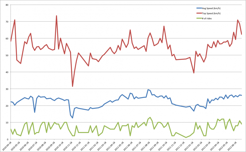
Rob asked about the app I use for tracking my rides. I’ve been using Cyclemeter since April 2010, and have found it to be pretty much ideal for what I do. I don’t want to have all of my ride data stored on a third party server (insert tinfoil hat conspiracy here, or, failing that, something grumbling about people monetizing my life). I like that Cyclemeter stores the activity data on my phone, and only exports it when I want it to, in the formats I choose. For instance, here’s a view of the weekly data, going back to April 2010:

I had Cyclemeter export a .csv file with weekly historical summary data, then pulled that into Excel and made a pivot table to make some sense of it, then made a chart of that to show activity over time. Having access to all of my own raw data is pretty handy.